Red Rising Wiki / Design system
The reading desk
A quiet archive for a loud universe. Character art leads; navigation stays precise. This is a companion you keep beside a book, not a page that asks you to keep scrolling.
Palette
#101214 · Page#191c20 · Surface#23272c · Hover#eee9df · Primary text#b2b1aa · Secondary text#d6bd8b · Selection & focus#373b40 · Borders#b66059 · Brand mark onlyTypography
Marcellus SC / Record titles
Red Rising Wiki
System sans / Interface & hierarchy
People to keep close
Search characters, worlds and terms. Short labels, clear actions, no shouting.
Alegreya / Long-form reading
The encyclopedia is set in a literary serif with a comfortable line length and generous leading. Caste never determines the typeface or the legibility of a record.
Actions & states
Brass means selected, actionable or focused. Ivory headings and stone supporting text are the default. Hover changes surface and border, portrait cards lift 3px, and pressed actions scale to .98. Surface feedback takes 140ms; movement and dialog entrance take 200ms. Reduced motion removes both. Keyboard focus adds a visible outline. Red is not a heading, link or selected-state color.
Portraits
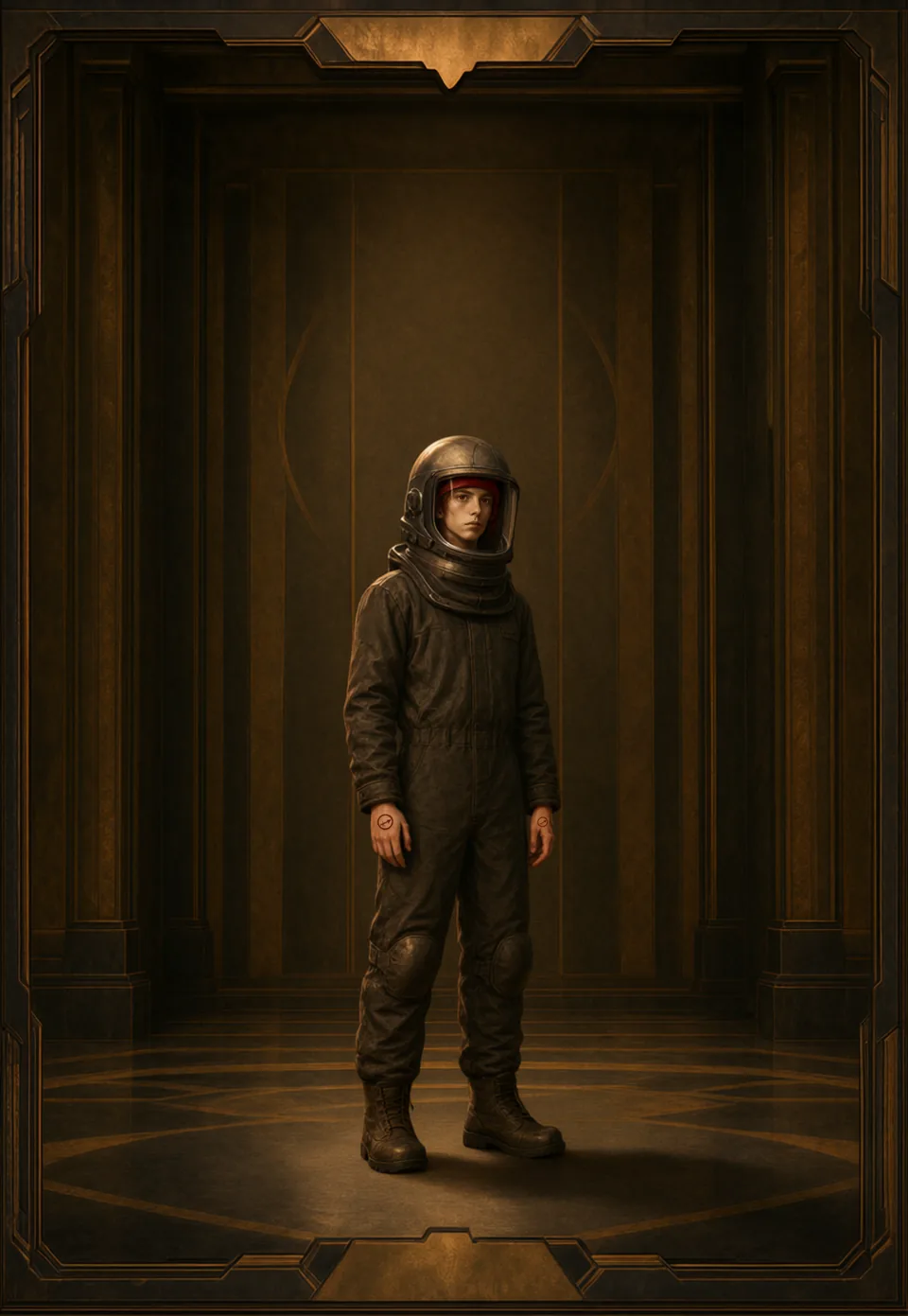
Use the existing portrait manifest and responsive image tiers. Give the art a dedicated surface and keep names underneath it, never over a face. Cards crop consistently; character records retain the full archive plate. No invented art when a portrait is unavailable. Every example below follows your spoiler shield.
Layout & spacing
The desktop home is a compact reading desk: lookup and character art in the primary column; a substantial interactive Mars and a compact directory in the secondary column. Use a 4px spacing rhythm, 8px control radii, 12px portrait radii and 16px panel radii, one-pixel seams and a restrained 1680px maximum workspace. Mobile stacks the workspace and uses a two-column portrait grid. Never clip content just to manufacture a one-screen claim.
Record details
Group related facts with the same labels across list and record views. Labels use supporting stone text; values use ivory. Keep book-aware values sealed.
- Affiliation
- House / faction
- First appearance
- Book title
Shared timelines
Every 3D view has the same book and Early / Middle / End controls. The view follows you between pages without raising your spoiler shield. Later books stay locked until your shield permits them. Exact-stage portraits are preferred; earlier supplied studies retain their labels. Characters without an eligible study have no portrait. Until sourced stage-specific world data is supplied, Early/Middle use the previous completed-book snapshot. Colors remains a static reference.
3D & motion
Preserve the draggable Mars, system map, Bonds, Holodeck, caste pyramid, book objects and depth portraits. 3D supports exploration without blocking lookup. Keep static images and text alternatives available. Respect reduced motion; never return to a scroll-driven opening sequence. Mars and map visibility always follow the reading position.
Content & accessibility
Progress is the last book finished, not a chapter-level spoiler guarantee. Later records, names, aliases, search results and relationship details stay sealed. Keep visible labels, readable supporting text and 44px touch controls. Never distinguish state by color alone. Current artwork uses only the selected source studies; visual improvements are not a canon-accuracy certification.
Do / avoid
Do: prioritize lookup, portrait identity, restrained brass, quiet surfaces and direct paths to records. Avoid: red paragraphs, caste-colored headings, repeated icon tiles, theatrical transitions, decorative metrics, long homepage sections and text layered over imagery.